Color Combinations That Always Work in Fashion
Fashion is a language, and just like any language, there are laws within it that, once learned, allow you to confidently communicate your ideas. Of these laws, one is key to unlocking your ability to fully explore fashion’s potential – learning how to pair colors effectively.
This guide is designed for anyone who has found themselves standing in front of their closet and questioning whether two colors complement each other. It will cater to those who prefer simplicity and minimalism in their fashion choices, as well as those who embrace maximalism and extravagance.
Why Color Theory Is the Foundation of Great Dressing
Before we explore each pair, it is essential to know why these combinations of colors are successful. Color theory, created mainly by painters, can be easily applied in fashion designs. The theory provides an explanation of how our eyes perceive the relationship between the colors.
The color wheel classifies colors according to their classification as primary colors (red, blue, yellow), secondary colors (green, orange, purple), and all the tertiary shades in between. There are three main types of relationships that fashion uses.
Complementary Colors
They are found diametrically opposite on the color wheel, like blue and orange or red and green. This is done to produce contrasting colors that create energy and vitality between each other, thus enhancing the look of each color through contrast.
Analogous Colors
This refers to colors which are adjacent to each other on the color wheel. They flow from one color to another harmoniously and can give a harmonious tonal effect.
Neutral Anchors
Black, white, grey, navy, beige, and camel colors may not be considered neutral according to science, but in fashion, these serve as neutral tones because they make other colors stand out.
With the knowledge above, the following combinations will become easier to understand.
Classic Color Combinations That Never Go Out of Style
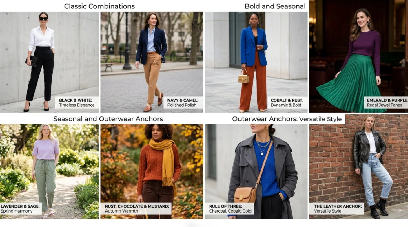
1. Black and White
In the entire world of fashion, there isn’t another more classic combination than black and white. It’s not only timeless; it’s dynamic. A pristine white shirt worn beneath sleek black trousers exudes authority and class. The contrast of a white midi skirt worn with a black bodysuit conveys romance and chicness. The proportions in this combination are very important; a split in equal amounts creates graphic appeal, whereas in unequal proportions, it gives off elegance.
2. Navy and Camel
Navy blue is among the easiest colors to wear; it is also an easy color to work with when used with camel/tan because it yields a look that is simultaneously stylish and warm. It is especially effective when using this combination on tailored looks. Wearing a navy blazer over a camel-colored turtleneck shirt or vice versa conveys a sense of elegance effortlessly.
3. Grey and Burgundy
Grey is one of the most undervalued neutrals when it comes to fashion due to the fact that it complements any other color. One of those colors that highlight the elegance of grey, without making it look too dull as black, is burgundy. The pairing creates a feeling of intellectual elegance that works best for the fall and winter seasons.
4. Olive and Cream
The olive green is a very earthy and complicated color choice for clothing. Olive green and cream or off white together create a wonderful contrast between them that is very soft yet very down to earth at the same time. This is an outfit choice which really works in casual as well as smart casual settings and it has a timeless quality about it, unlike many trendier colors.
5. White and Tan
All-white looks are extremely effective, yet sometimes may lack character without proper accessories. If you want to give your all-white outfit some warmth and depth, then add a tanned leather belt, a handbag, or even some loafers. Likewise, a tanned trench coat paired with an all-white look will do wonders, especially when it comes to the seasons between spring and autumn.
Bold Color Combinations for Those Who Want to Stand Out
Cobalt Blue and Rust Orange
This is almost complementary to each other on the color wheel, but their union creates a pairing that is striking, sure, and surprisingly elegant if done with good-quality materials and clean lines. Cobalt blue blazer with rust-colored pants is the perfect example of such an outfit.
Emerald Green and Deep Purple
Both colors fall under the category of jewel tones, which come with intrinsic richness making them ideal partners. Combining emerald green and purple creates a maximalist combination suitable for occasions that take place in the evenings. The secret to this combination is to ensure the colors used are in pure hues.
Pink and Red
This combination used to be seen as a huge no-no in terms of fashion. Now, it has become one of the most praised combinations. Hot pink paired with dark red clashes but comes off intentionally and boldly. Soft pink and soft red pair well to create a delicate and romantic combination.
Yellow and Grey
Yellow is among the most dynamic colors in the realm of fashion, and it can be overpowering when used incorrectly. The best color to tone it down is grey. When combined, they give you a contemporary look that is both cheerful and smart. For instance, a mustard-yellow sweater paired with grey wide-leg pants would give you an appropriate color palette for the season.
Seasonal Color Combinations That Deserve More Attention
Spring: Lavender and Sage Green
Both colors suggest nature at its best. Lavender comes across as light and airy, while sage green gives the impression of being grounded. The two complement each other to create an ensemble that is seasonally appropriate but not overly suggestive. These colors work well when worn in natural materials such as linen, silk, and cotton.
Summer: Coral and White
The color coral is far more complicated than a simple orange or pink, making it more intriguing and versatile. It contrasts beautifully with white, making a look that’s crisp, warm, and easy like a good summer wardrobe should be.
Autumn: Rust, Chocolate, and Mustard
The trio tonal effect in this combination is among the most pleasing combinations in fashion. All colors used are warm, earthy, and reflective of the autumn season colors themselves. The effect is achieved through the use of different textures – rust colored knit, chocolate suede pants, and mustard scarf.
Winter: Ivory, Charcoal, and Deep Forest Green
One may tend to dress in all black during winter, but the three-color scheme allows for more variety while still being suitable for cold weather occasions. The color ivory is used for brightness, charcoal gives contrast, and forest green brings out nature into the mix.
How Outerwear Becomes the Color Anchor of Your Entire Outfit
The importance of outerwear when it comes to color dressing cannot be emphasized enough. As it turns out, the coat or jacket is usually the most visible piece of clothing you wear and thus becomes the primary color note. The rest of your outfit needs to complement this look in some way, either by matching or by contrasting the jacket.
That’s when high-quality outerwear that is meant to enhance all your looks really comes in handy. For instance, a quality leather jacket can help you build any color combination with ease and grace. High-quality design and perfect fit show how confident you are about choosing colors. Your color combinations will shine through because of this.
For customers looking for such outerwear as color anchors, there’s a wide selection at Oskar Jacket. You’ll find a number of leather and outerwear options at the store that are sure to go with any color combinations.
The Rule of Three: Building Color Combinations That Always Work
One very effective way of designing an outfit using different colors is by the use of Rule of Three. In this case, the first step is selecting a dominant color that comprises 60 percent of your outfit. The next one is choosing a second color that occupies 30 percent of your outfit. The third color should occupy 10 percent of your outfit.
The dominant color is normally the biggest item on your outfit, either a trouser, a dress, or a coat. The second color can be added by the use of a top, skirt, or blazer. The accent color can be added using accessories, shoes, a handbag, or a scarf.
In other words, there needs to be hierarchy among colors for them to look appealing.
Practical Application of the Rule of Three
Example one: Dominant camel (pants), secondary white (shirt), accent burgundy (belt and shoes). Example two: Dominant forest green (midi dress), secondary cream (cardigan), accent tan (leather purse). Example three: Dominant charcoal (wide-legged pants and blazer), secondary cobalt blue (knit), accent gold (accessories and shoes).
In all cases, the combination is determined by the structure, not random chance. That’s why individuals who have an innate sense of style will always appear well put together, no matter how daring their combinations.
What Skin Tone Has to Do With Color
Color combinations are never isolated entities because they have a dynamic relationship with whoever is wearing them, meaning that their skin tone has an important part to play in determining which combinations will suit different people. This isn’t an attempt to restrict you in your choice of colors but to help guide you toward combinations that will bring out your best side.
On a general basis, warm skin tones with golden, peach, and olive undertones look great with warm combinations such as camel and rust, olive and cream, and terracotta and ivory. Cool skin tones with pink, red, and blue undertones look absolutely fabulous in cool combinations such as navy and grey, cobalt and white, and lavender and charcoal.
Neutral skin tones can pull off a wide variety of combinations ranging from warm to cool. But remember, it isn’t always set in stone because the key thing is how combinations make you feel.
Pattern Mixing and Color: A Brief Guide
After you get familiar with combining solid colors, moving on to pattern is only the next logical progression. However, in this case, the basic idea to remember is that pattern combination is most effective when there is some color that both patterns feature.
For instance, a navy and white striped top along with a navy and cream checked blouse will work perfectly because of their navy and white. In another instance, the terracotta, rust, and sage floral dress in combination with the sage trousers looks great because the sage color is drawn from the dress.
As you add more and more patterns, it becomes increasingly necessary to have one element that runs in all the patterns.
Common Color Combination Mistakes and How to Avoid Them
Matching Too Precisely
Using accessories in the exact same tone of the exact same color would be considered a too literal approach. The best way to dress is tonally; this means pieces have the same color family, yet their shades differ a little. This way, ivory and cream would make for better choices than an exact match of those colors.
Ignoring the Undertone
All whites are not equal whites. All beiges are not equal beiges. There is always an underlying tone, either warm or cool, that defines a neutral color. Conflicting undertones account for why certain color schemes, although seemingly correct, sometimes appear wrong because they do not fit properly together.
Overloading on Trend Colors
Every season, fashion publications announce the colors of the moment. While there is nothing wrong with incorporating trend colors, building an outfit entirely out of them often produces a look with a very short shelf life. The most durable outfits anchor trend colors within a framework of classic combinations.
Neglecting the Role of Shoes
The color of footwear serves as the last element in any color scheme, which may either help to create harmony or destroy it completely. In cases where there’s no confidence, opting for neutral shades such as nude, tan, black, white, or metallic colors will not fail. However, when there is confidence, choosing footwear that compliments other items in the outfit would be ideal.
Building a Wardrobe Around Color Combinations That Always Work
The most practical use for all that’s discussed here is having a closet filled with clothes that you can easily combine with each other. This method is known as the capsule wardrobe concept, and it relies on colors.
Firstly, determine what your three or four favorite colors are. These colors form the base of your wardrobe. Choose one or two accent colors that will match your base colors. Fill your wardrobe mainly with items of these colors, and you’ll notice that it takes less time to dress yourself, and your outfits always look well-thought-out.
The advantage of this method isn’t about restriction but rather about fluency. When your colors talk to each other, any combination that you choose will automatically be approved by your palette logic.
Conclusion
Color is arguably the single most influential element that one can use in the world of fashion. Color says something about your mood, your personality, and your intentions before you even utter a single word. These combinations, ranging from the traditional black and white to the daring jewel tones all the way to seasonal combinations, are not random. Each of them is based on principles of color theory, the principles of tonal dressing, or fashion that spans several decades.
It is important that we learn these principles not simply by rote but rather well enough that we know when it is appropriate to adhere to and when to go beyond these principles. Only then will we truly enjoy using colors as a means of expression while getting dressed.
In order to create a versatile wardrobe that can be used within multiple color combinations, invest in versatile pieces. Learn what colors suit your skin tone. Be intentional. Lastly, do not underestimate the power of the outer layer.
Related Posts


Top Corporate Motivational Speaker Perth Nathan Baws Experts
Introduction If you are currently on the hunt for a corporate motivational speaker who brings more than just a loud voice and a few PowerPoint slides to the stage you probably know how high the stakes are for modern teams. Organisations across Perth and the rest of Australia are navigating an era of relentless change. Whether it is shifting market demands evolv
Custom Candle Packaging: Elegant and Protective Solutions for Modern Brands
Intro Custom candle packaging is an essential element for businesses that want to deliver both protection and a premium presentation for their products. Candles are often associated with luxury, relaxation, and gifting, which means their packaging must reflect the same level of quality and care. Custom candle packaging helps protect candles from damage, dust, a

Architect Drafting Services for Modern Mountain Homes
Building a custom home in a mountain destination takes more than inspiration from Pinterest boards or a rough sketch on paper. It requires careful planning, technical precision, and a design team that understands how to create homes that work beautifully with the surrounding landscape. That’s where architect drafting services become essential. Whether youR
Leave a Reply